01
Material language
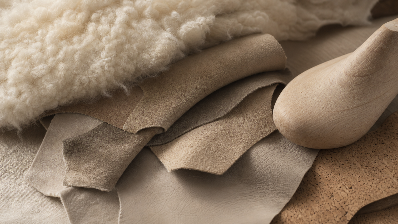
AU&MU starts from material: wool softness, suede nap, leather grain, cork support, and last structure form the tactile base of the brand.
About AU&MU
AU&MU's brand image is shaped by material, color, scene, craft, and daily wear. It is not a gallery of nice pictures; it explains how the brand should feel and why the products look the way they do.
Return to shopping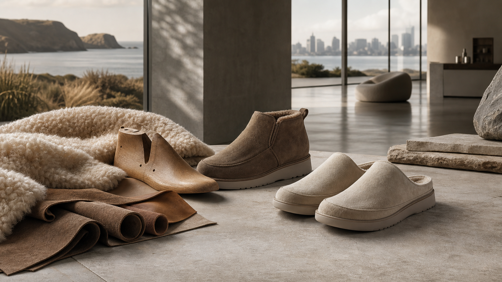
01
AU&MU starts from material: wool softness, suede nap, leather grain, cork support, and last structure form the tactile base of the brand.
02
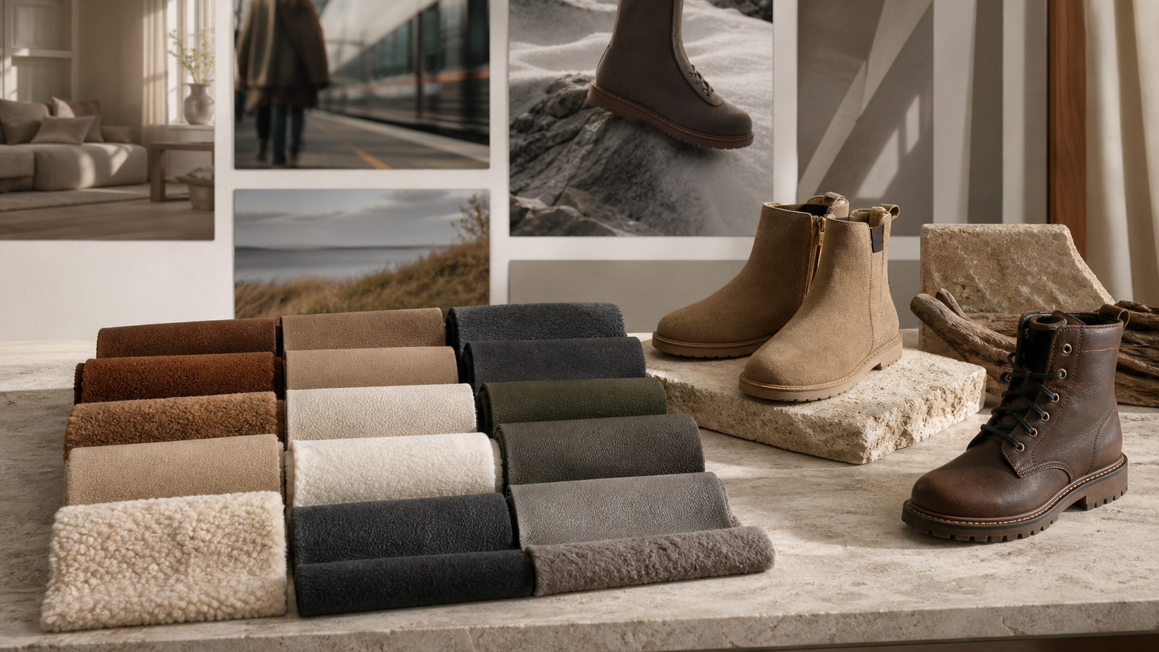
Color is not only a palette. Chestnut, sand, ivory, taupe, charcoal, olive, and stone grey connect to home, commute, weekend, travel, and cold-weather walking.
03
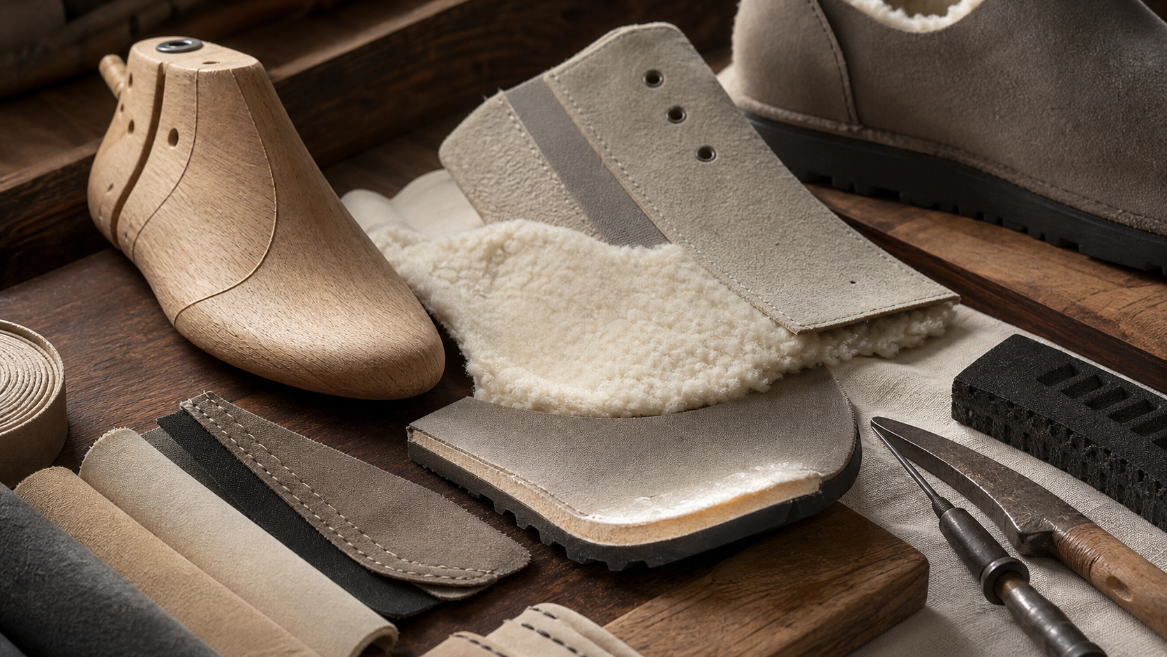
Craft appears through lasts, stitching, edges, lining, and outsole structure. AU&MU uses construction details to express stability and durability.
04
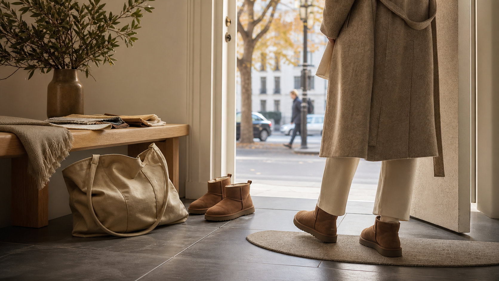
Comfort belongs in daily rhythm: leaving home, commuting, returning, weekends, and short trips. The imagery stays restrained and grounded.
05
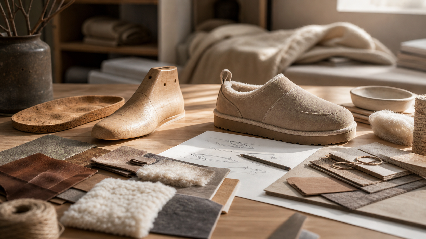
AU&MU can be read in three lines: natural materials create touch, last structure creates stability, and quiet silhouettes make the shoes easier to live with. Brand imagery should make those links visible.
06
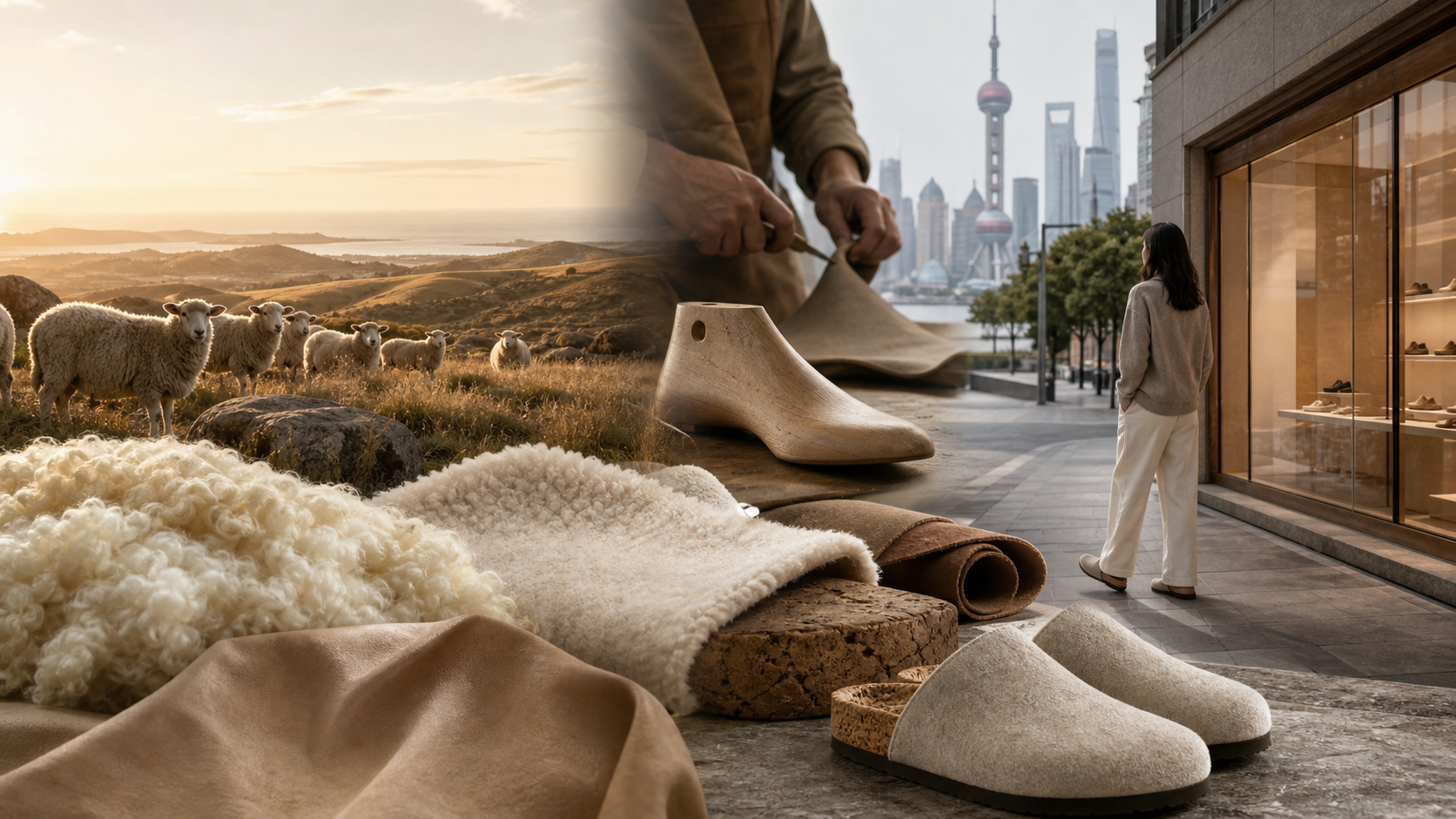
The legacy story starts with Australian nature, wool, and winter boots. The new site translates that origin into a modern Chinese context: material that can be felt, comfort that can be understood, scenes that feel reachable, and a clearer path to purchase.